
Yabbes Rajan
Ross West
Jinwen Fu
Vaishnavi Sivaramakrishnan
By
enhancing docit
hci design project 2024
A User-Centric Redesign
Apharo Health Futures
Partnering with
Dr. Conor Malone

PROJECT OVERVIEW

Enhancing the User Experience OF DocIT - an overview
As a part of my final semester, I undertook a real-time design project with three more people as a team to overhaul the user experience (UX) of the DocIt , a task management platform used in hospitals like Beacon and Beaumont.
The platform faced significant issues with navigation, task flow, and screen clarity, reducing its effectiveness in managing hospital wards. Our goal was to improve usability, focusing on redesigning specific functionalities, creating an intuitive user interface, and making the app more accessible for users with colourblindness and dyslexia.
PROJECT PARTNER
inTRODUCING THE PROJECT PARTNER
Apharo Health Futures, based in Ireland, specialises in digital technologies for healthcare, including the widely successful DocIT app, which has transformed task management and communication in hospitals over the past decade. Founded by Dr. Conor Malone, an eye surgeon with expertise in IT and digital transformation, the company focuses on enhancing hospital efficiency and patient care.
DocIT is an electronic task management system designed for acute care settings, addressing issues like illegible handwriting and missed communications. It improves time management, productivity, and communication among healthcare staff. The app has been used for 10 years at Beacon Hospital and 6 years at Beaumont Hospital, achieving high user satisfaction and significant operational improvements.
64%
Improved Time Management
Decrease in the number of Received calls
82%
50%
Productivity Improvement
86%
System Satisfaction
DESIGN CHALLENGES
DISCOVERING THE DESIGN CHALLENGES
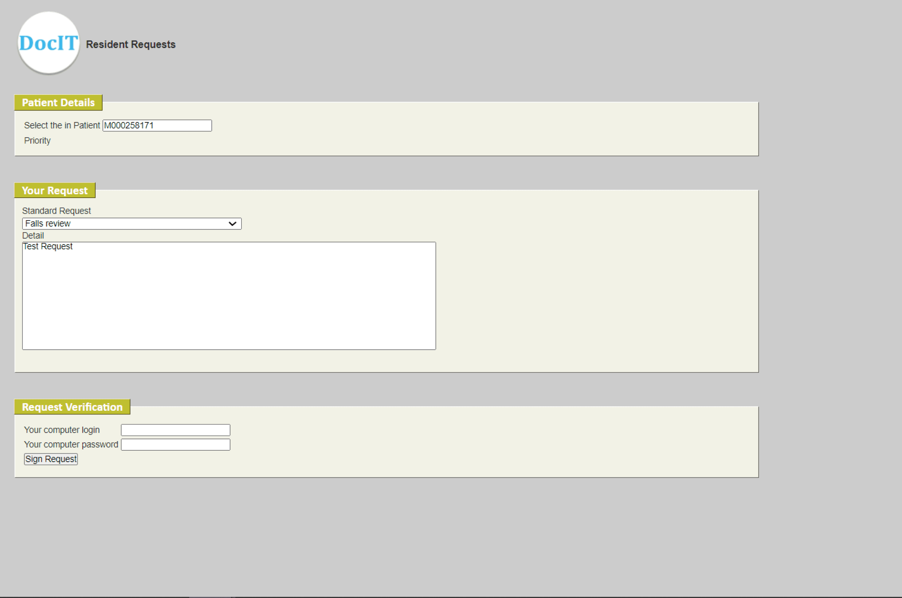
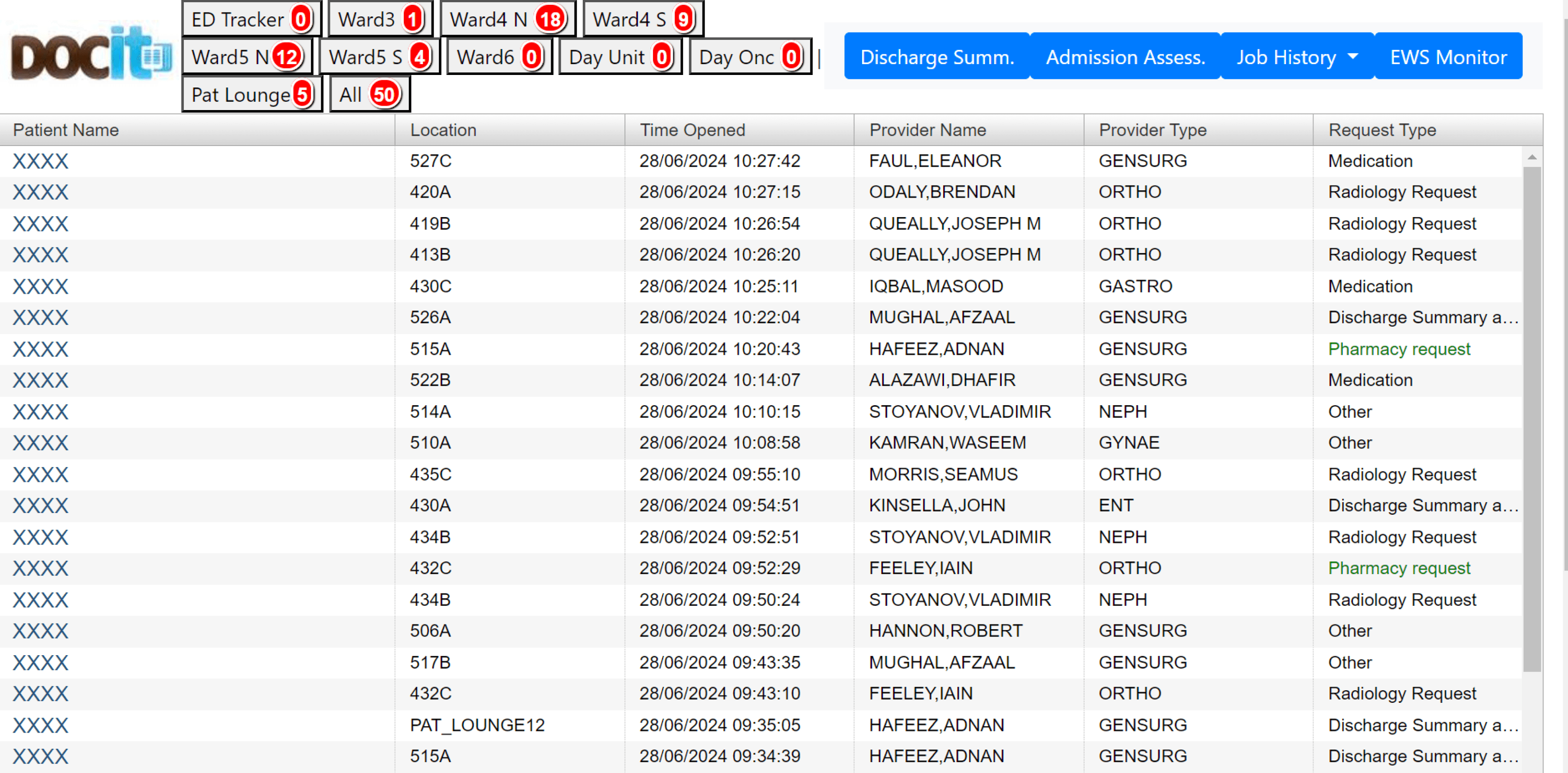
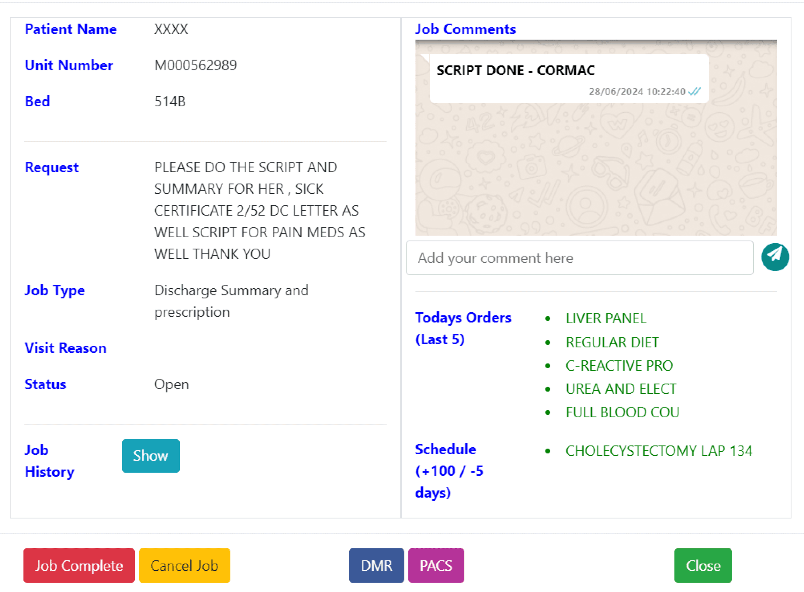
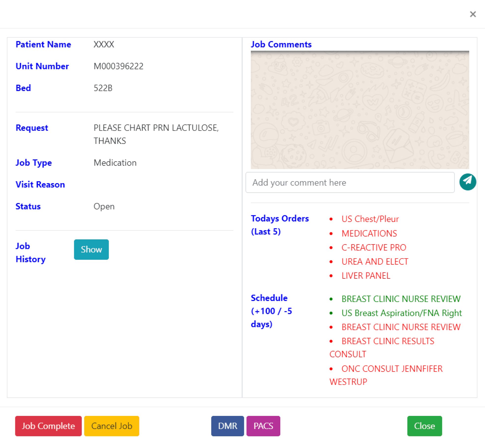
Existing screens of DocIT
To initiate our project, we had a Zoom meeting with our project partner, Dr. Conor, where he provided us with an initial briefing and outlined the main challenge ahead. During the meeting, Dr. Conor thoroughly explained DocIt, its purpose, and its current usage. He then presented us with the challenge: to redesign the DocIt user interface to deliver an enhanced user experience, optimised accessibility, and improved usability.
👩🏻💼
User-Centred
Design Approach
The new design should prioritise streamlining workflows of doctors; and nurses’ by understanding their frustrations with task management. We need to create an intuitive system that minimises the cognitive load required to complete tasks.
🔮
simplicity and efficiency
The new design should prioritise simplicity over unnecessary features. Functionality should be clear and easily accessible. Ensure a consistent user experience across all devices (desktop, mobile, tablets) used by healthcare professionals.`
👁
Fostering Inclusivity and Accessibility
Integrate accessibility features to accommodate users with dyslexia, colour blindness, and other visual impairments. This includes using clear, concise language and maintaining good colour contrast. Utilise clear and easily recognisable icons to enhance usability and reduce reliance on text alone.
Three major goals of the project
DESIGN APPROACH
from sketch to design : dodging snakes and climbing the design ladder
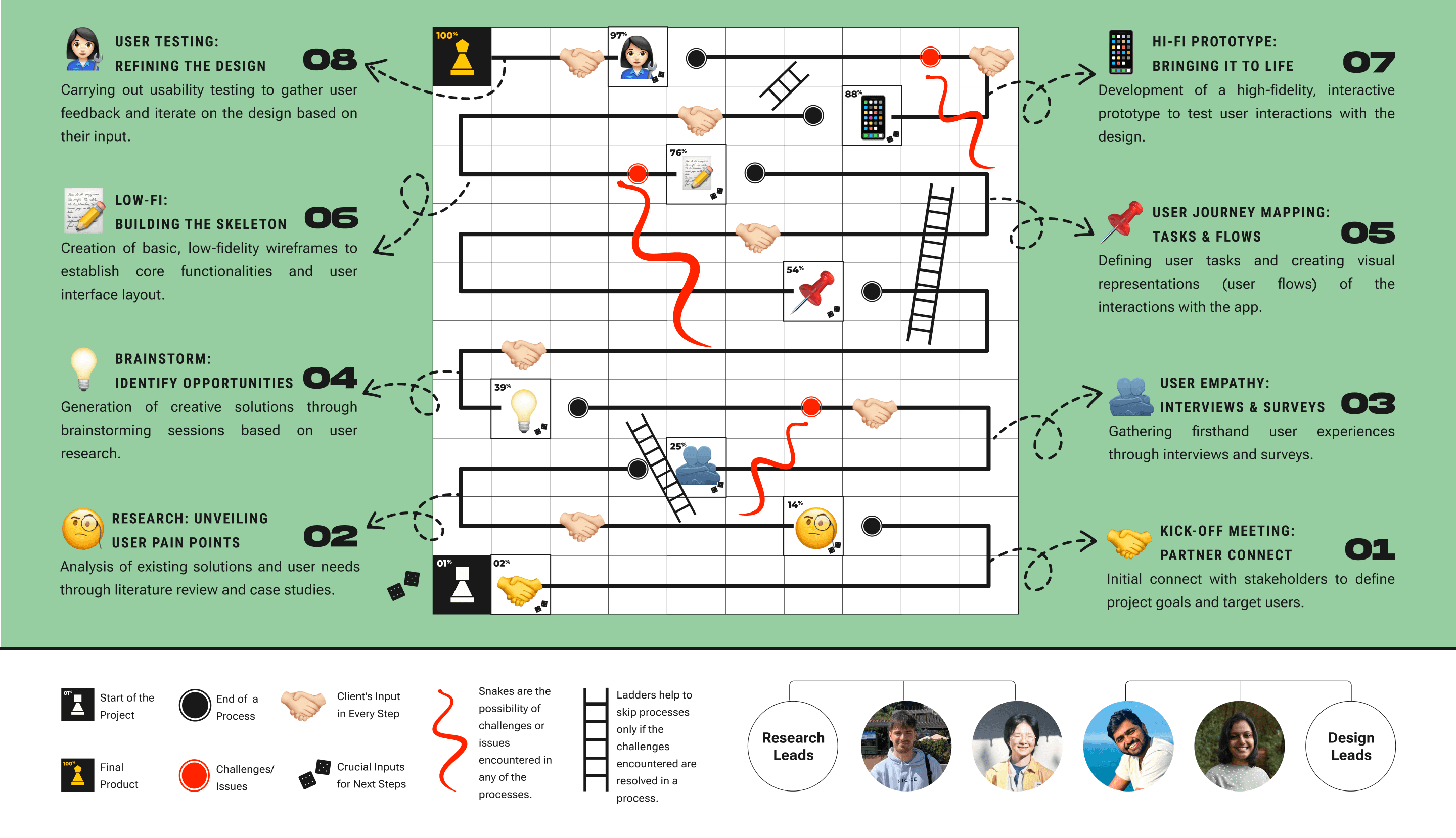
USER RESEARCH
User Journey map:
A Day in the Life of a Doctor with DocIT
In the process of empathising with users, we mapped the user journey of DocIT, revealing the various emotions a DocIT user experienced at each stage, based on the inputs from our client. This mapping also allowed us to understand the existing user task flow and its pros and cons.
Dr Emily enters the crescent to login to DocIT to close the requests created for different Patients.
😐
Neutral
😕
Confused and Puzzled :
Categorisation of the wards
😰
Overwhelmed: No clear distinction between different informations
😕
Confused: Lack of confirmation of data updating.
😖
Stressed


Dr. Emily reads the patients medical history and the necessary treatment to be given and treats the patient.
Post treatment, Dr. Emily updates the current health condition and medication of the patient and closes the Request
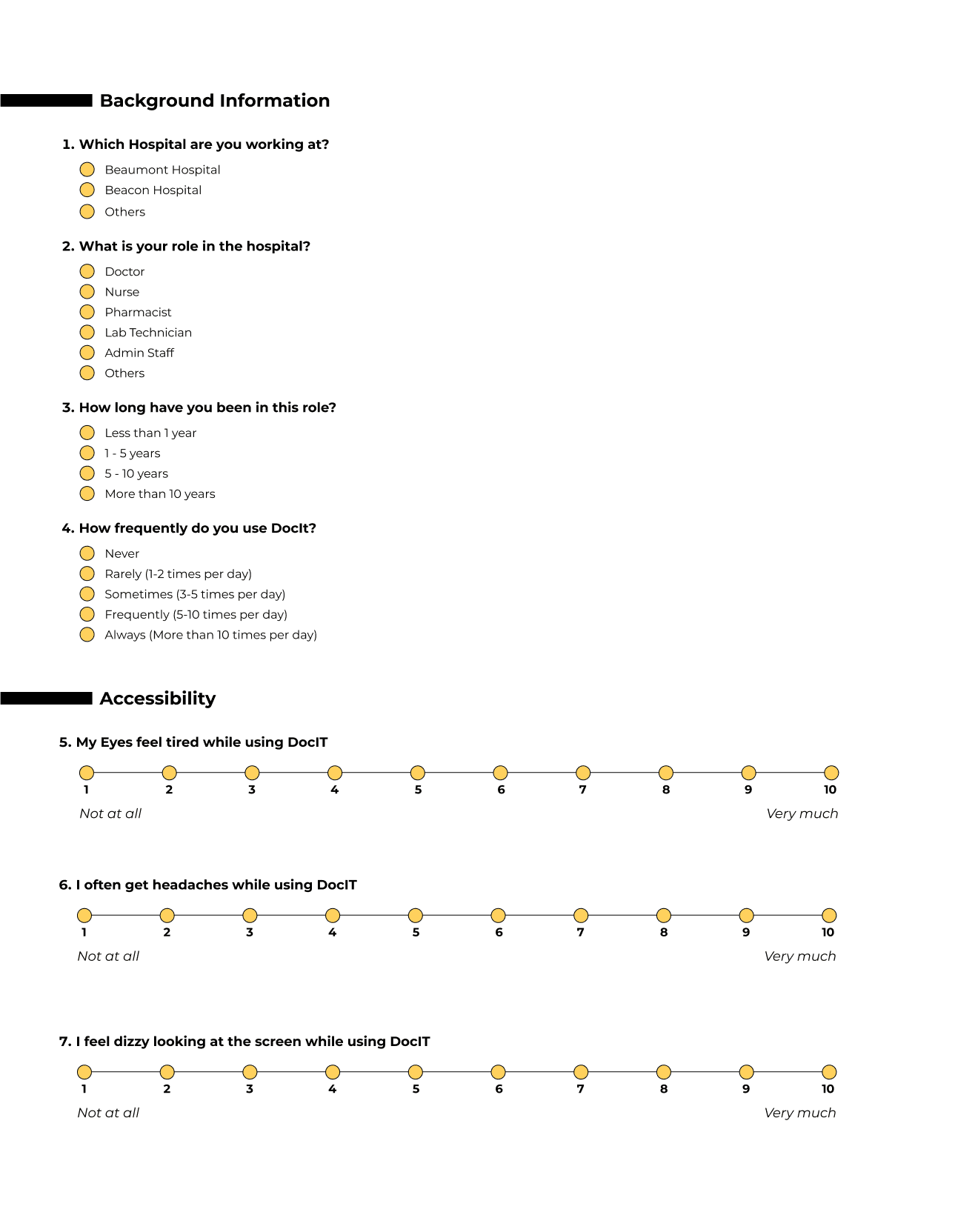
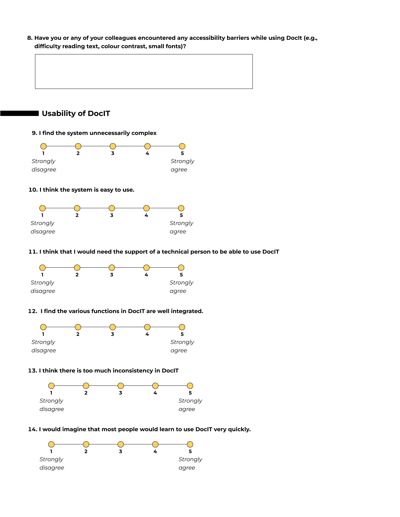
Designing a User Survey to Gather Key Insights
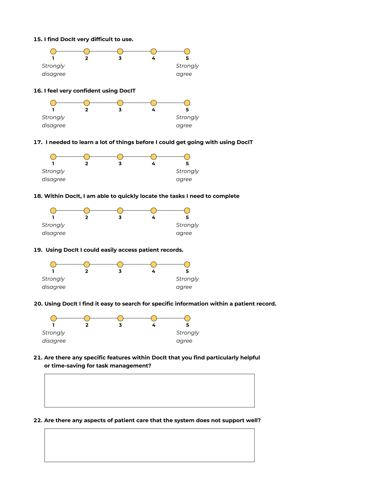
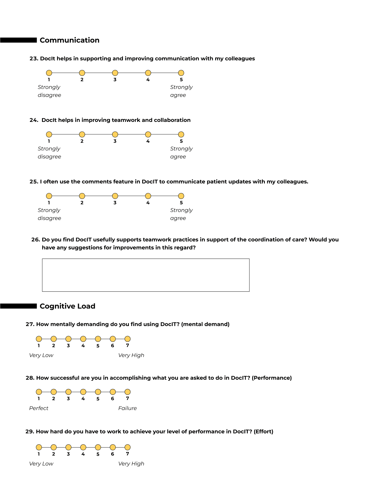
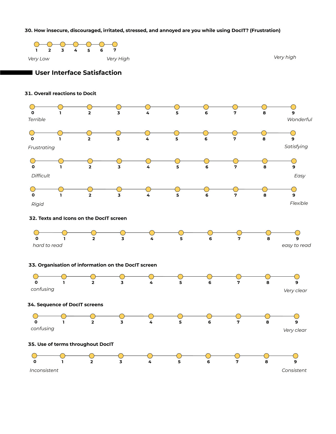
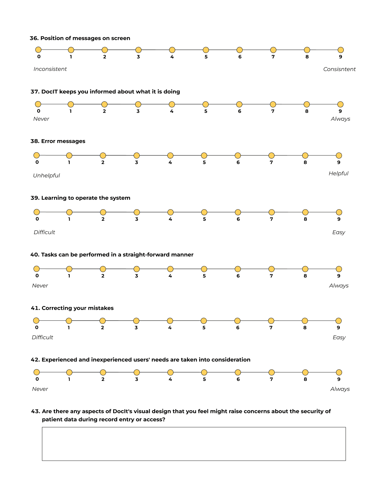
To deepen insights from user journey mapping and understand healthcare professionals' experiences with the platform, we designed a user survey. It included both Likert scale and open-ended questions, integrating several standardised surveys to assess various aspects of DocIT. Key focus areas were:
Usability: Assessed using the System Usability Scale (Brooke, 1995).
Satisfaction: Measured by the User Interface Satisfaction questionnaire (Chin et al., 1998).
Cognitive Workload: Evaluated through the NASA Task Load Index (Choi et al., 2024).
Visual Fatigue: Measured by the Visual Fatigue Questionnaire (Heuer et al., 1989).
Quick search and response sections are particularly helpful and time-saving for users.
Users found the quick search and response section useful but suggested improvements in the comment area.
Significant concerns about communication features indicate a need for improvements to ensure traceability and awareness of comments.
There is a freezing issue that needs to be addressed in the backend.
Task management
Feature Requests
communication barriers
usability issues
Key insights from data analysis
We analysed the Likert scale responses using statistical methods and the open-ended questions through thematic analysis. This approach provided valuable insights into users' overall perceptions of the system. The participants' professional backgrounds further enriched the data, as they had been using the system extensively in their roles over a significant period.
Analysing user survey responses provided valuable insights into system perceptions, especially given participants' extensive use in their professional roles. However, the study faced limitations. The response rate was low (only three participants), limiting the sample size and preventing robust quantitative analysis or cross-tabulations. Additionally, all respondents were pharmacists, introducing potential bias and reducing the diversity of perspectives.
MAJOR LIMITATIONS OF DATA ANALYSIS


HEURISTIC EVALUATION
Heuristic analysis on 3 task flows
IDENTIFYING USABILITY ISSUES USING HEURISTIC EVALUATION METHOD
Due to weaknesses in our survey-based user analysis, we explored alternatives and determined that a heuristic evaluation would be more effective, given the low participant contribution. Using Jakob Nielsen’s “10 Usability Heuristics for User Interface Design,” we evaluated key screens and tasks in DocIT. This process highlighted strengths, weaknesses, and opportunities for improvement, ensuring a more user-friendly experience.
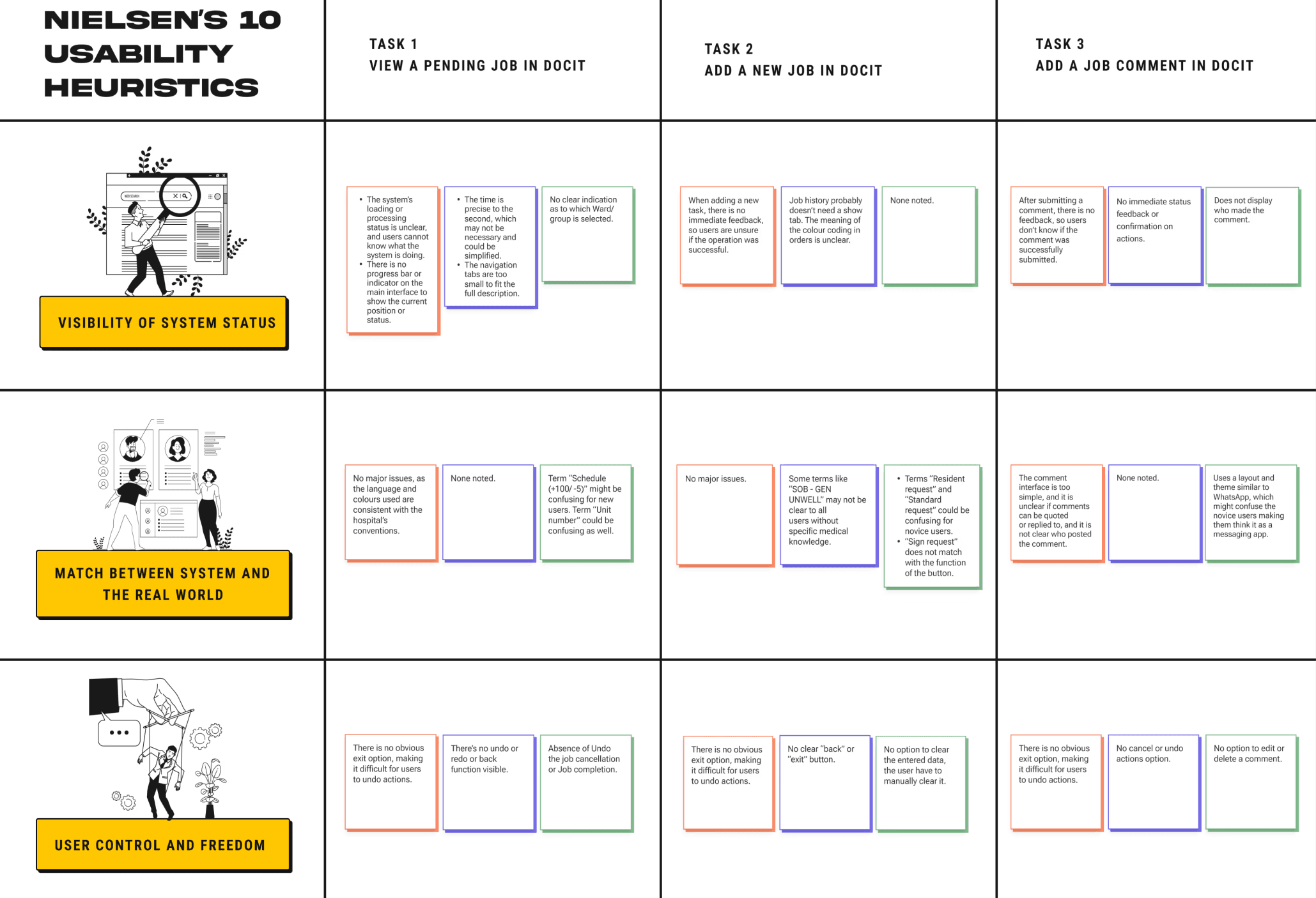
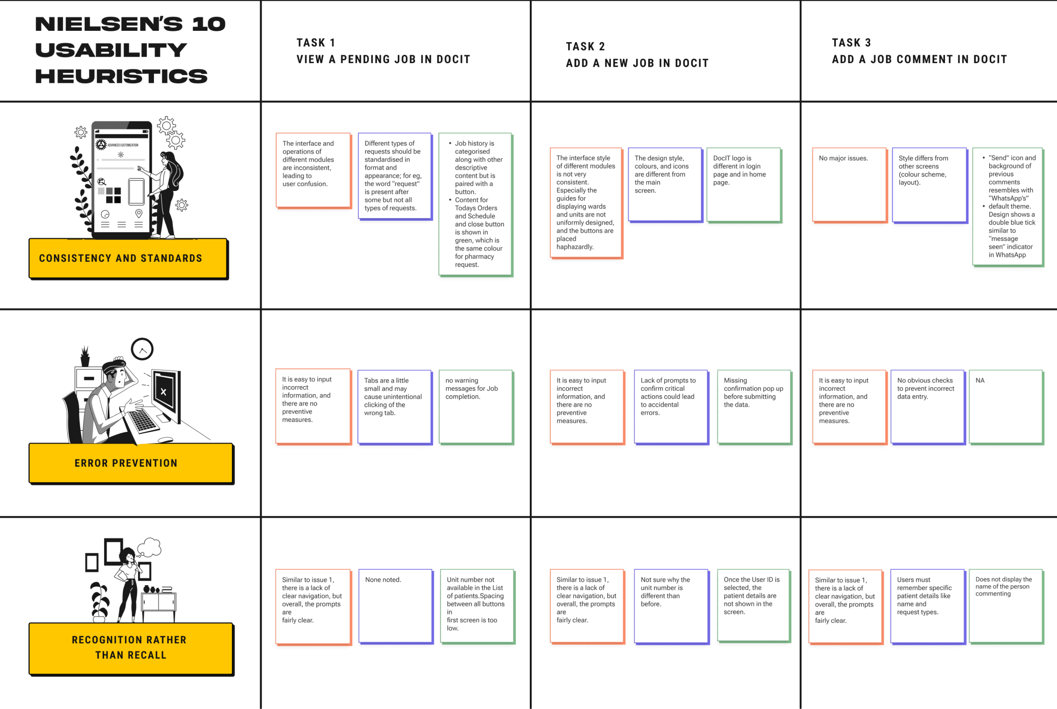
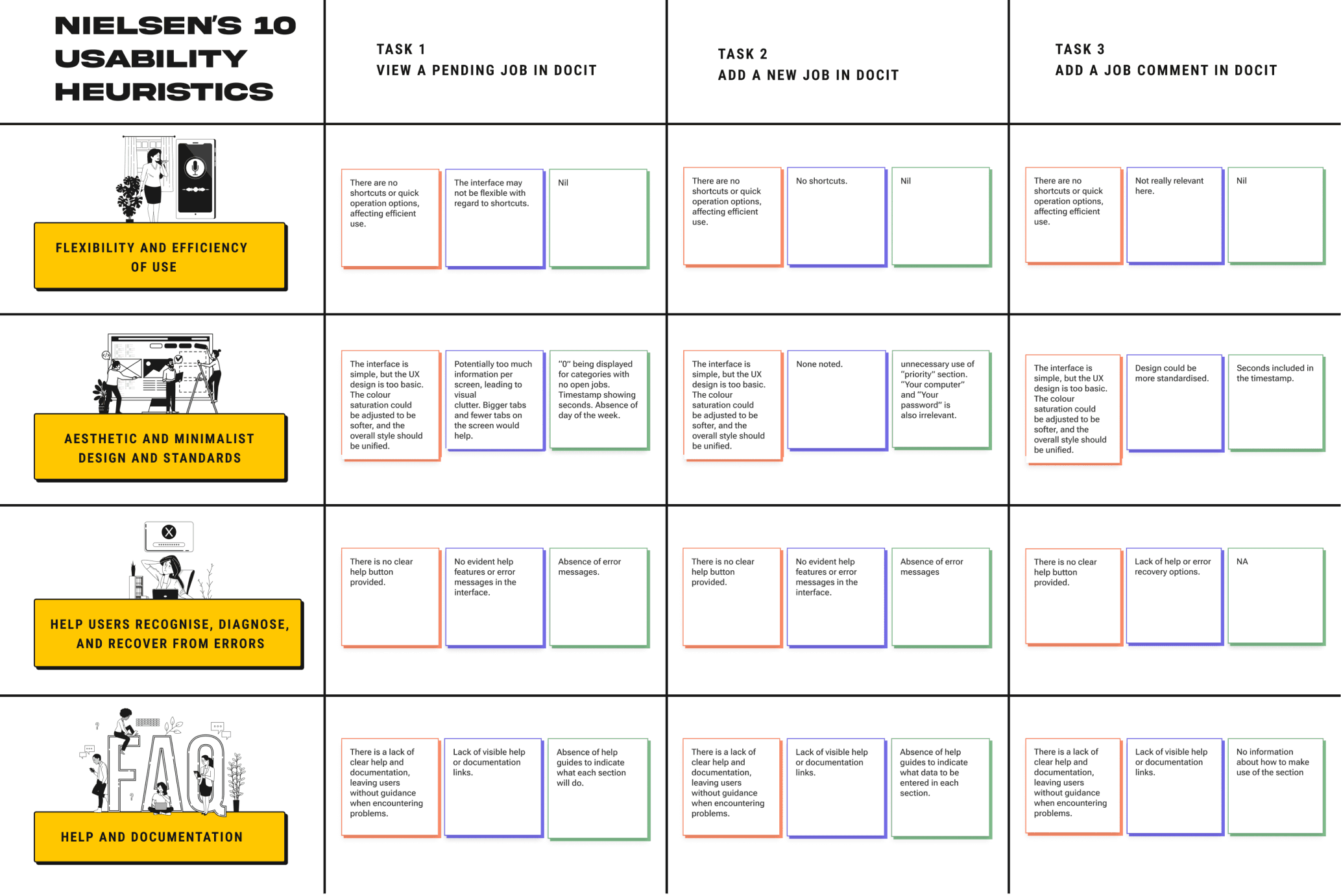
AFFINITY DIAGRAM
Task 2
Add a new Job in DocIT
creating an Affinity Diagram to Identify common themes & issues
Task 1
View a Pending Job in DocIT
Task 3
Add a Job comment in DocIT
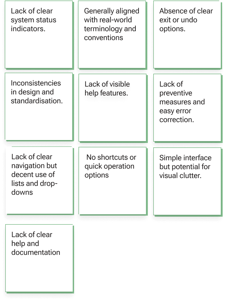
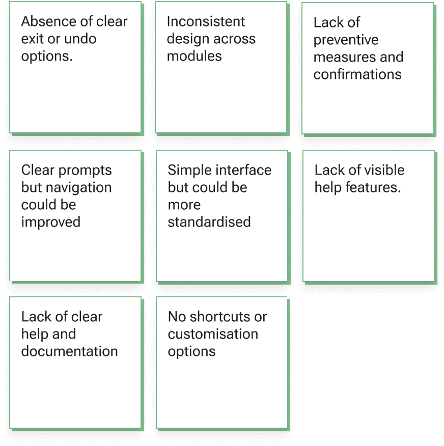
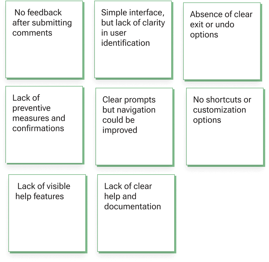
Following the heuristic evaluation, we organised the identified usability issues using an affinity diagram. This helped us group the findings into themes and categories, making it easier to spot patterns and common pain points. To sharpen our focus, we also created a priority map, which further clarified which issues to address first.

p0
p1
p2
p3
p4
Initiation of Design
final product
Lack of Clear Design Indications & Lack of Error Prevention
Need for Better Navigation & Lack of Feedback
Lack of
Intuitive Design
Visual Clutter & Inconsistencies
Lack of visible help
prioritising major usability issues
USER PERSONAS
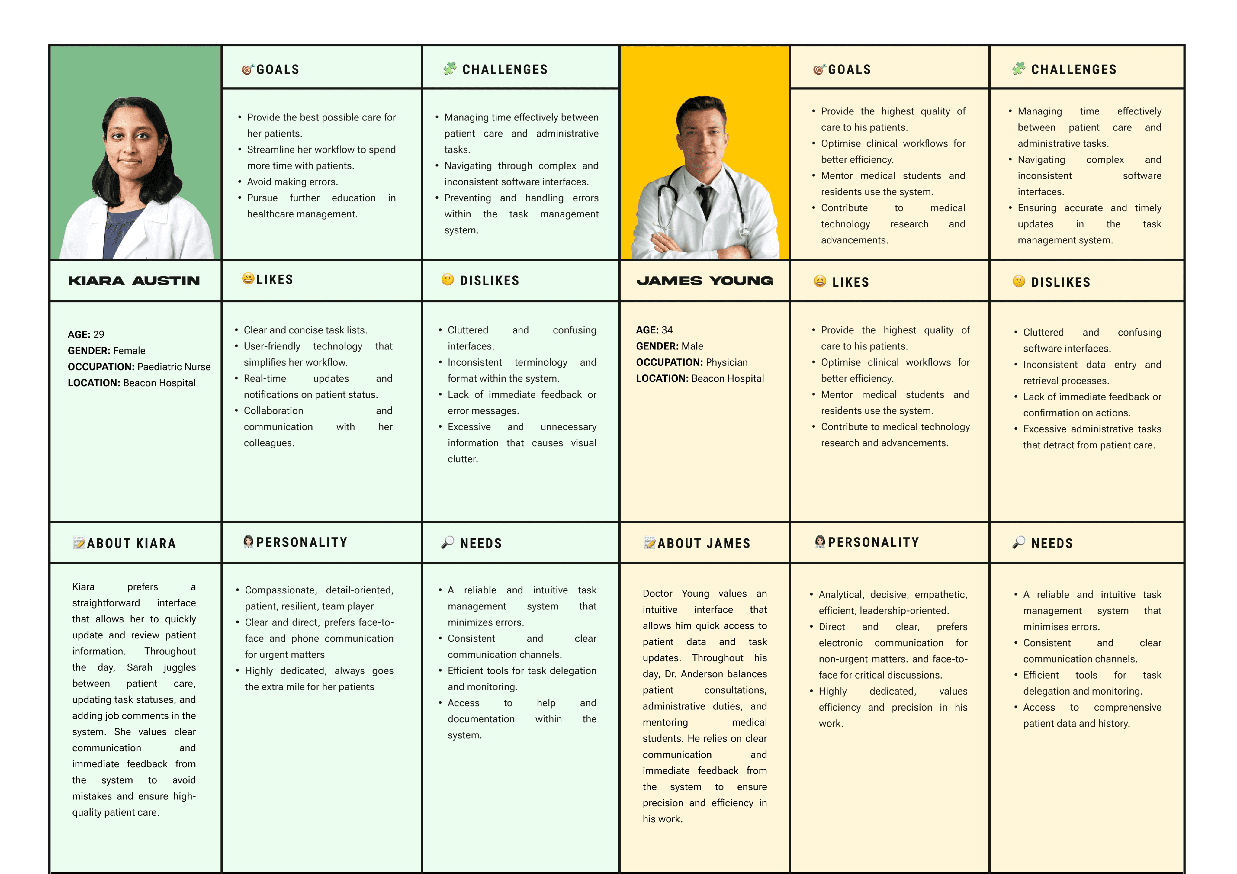
Creating user personas to guide our design decisions
While the initial brainstorming and evaluations highlighted user challenges, we lacked a deeper understanding of their needs. To address this, we created user personas, which provided insights into their goals, motivations, and behaviors. This helped us make more informed design decisions and ensure our solutions align with users' needs and preferences.
DESIGN IDEATION
generating creative solutions to address the problems identified
This phase of the project was solely focused on ideating the initial sketches for DocIT’s new user interface. We approached the results of the heuristic evaluation with a “How Might We” activity, which helped us in the next step to generate creative solutions to the identified usability problems. Based on the “How Might We” activity’s output, we individually created initial wireframes for the new system.
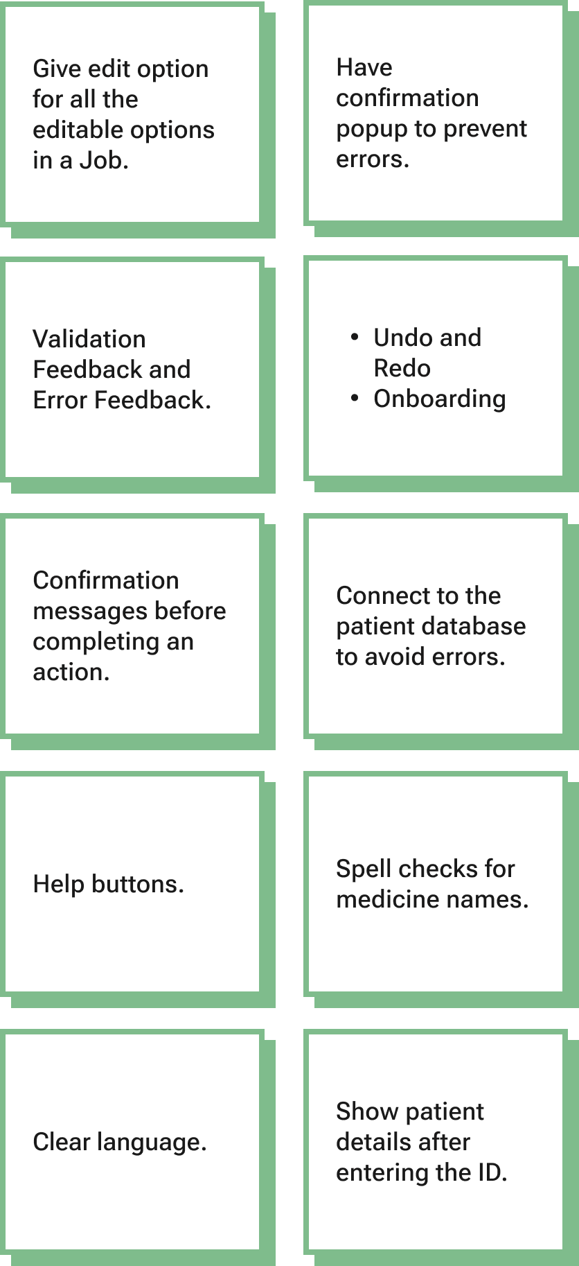
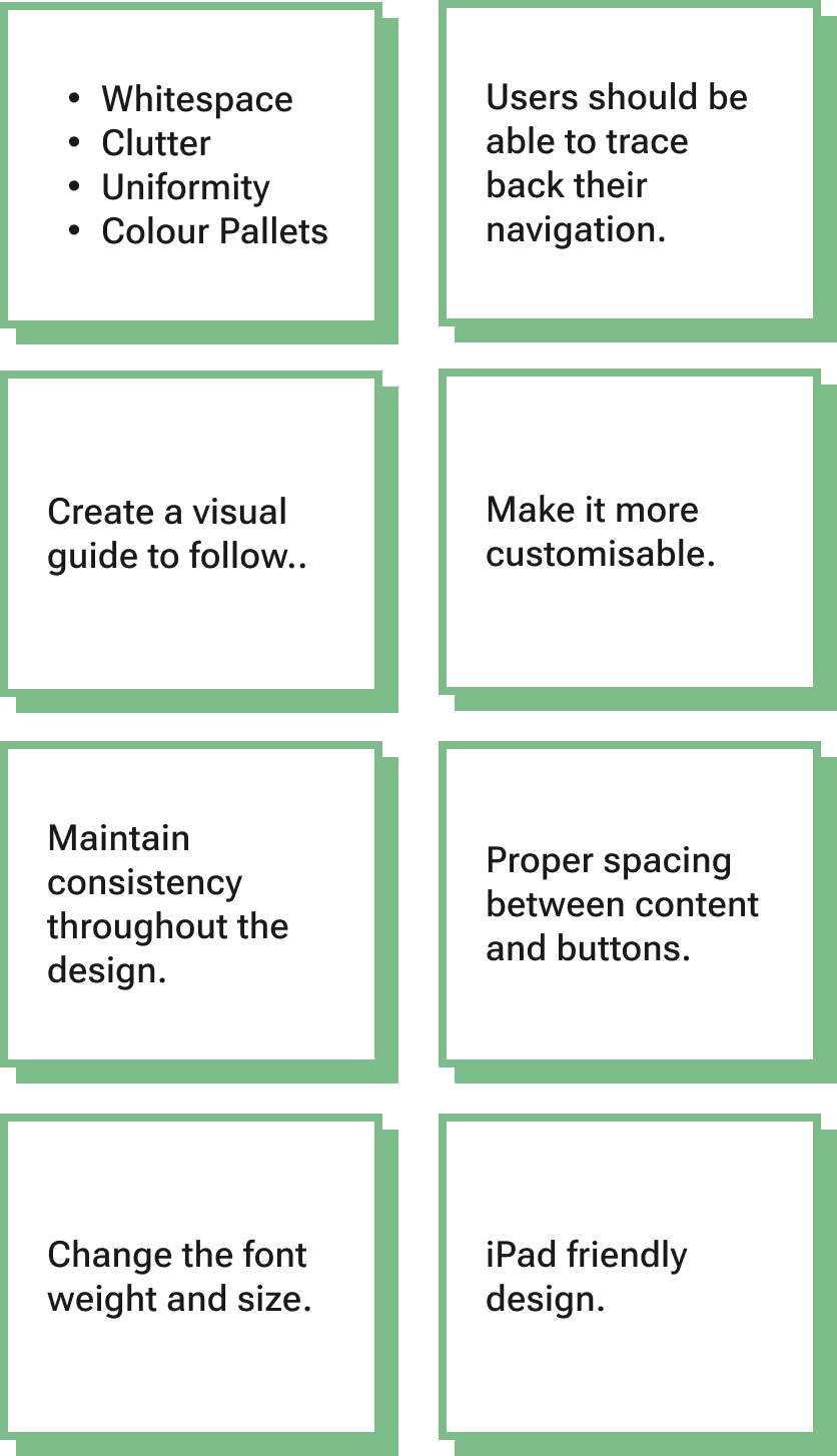
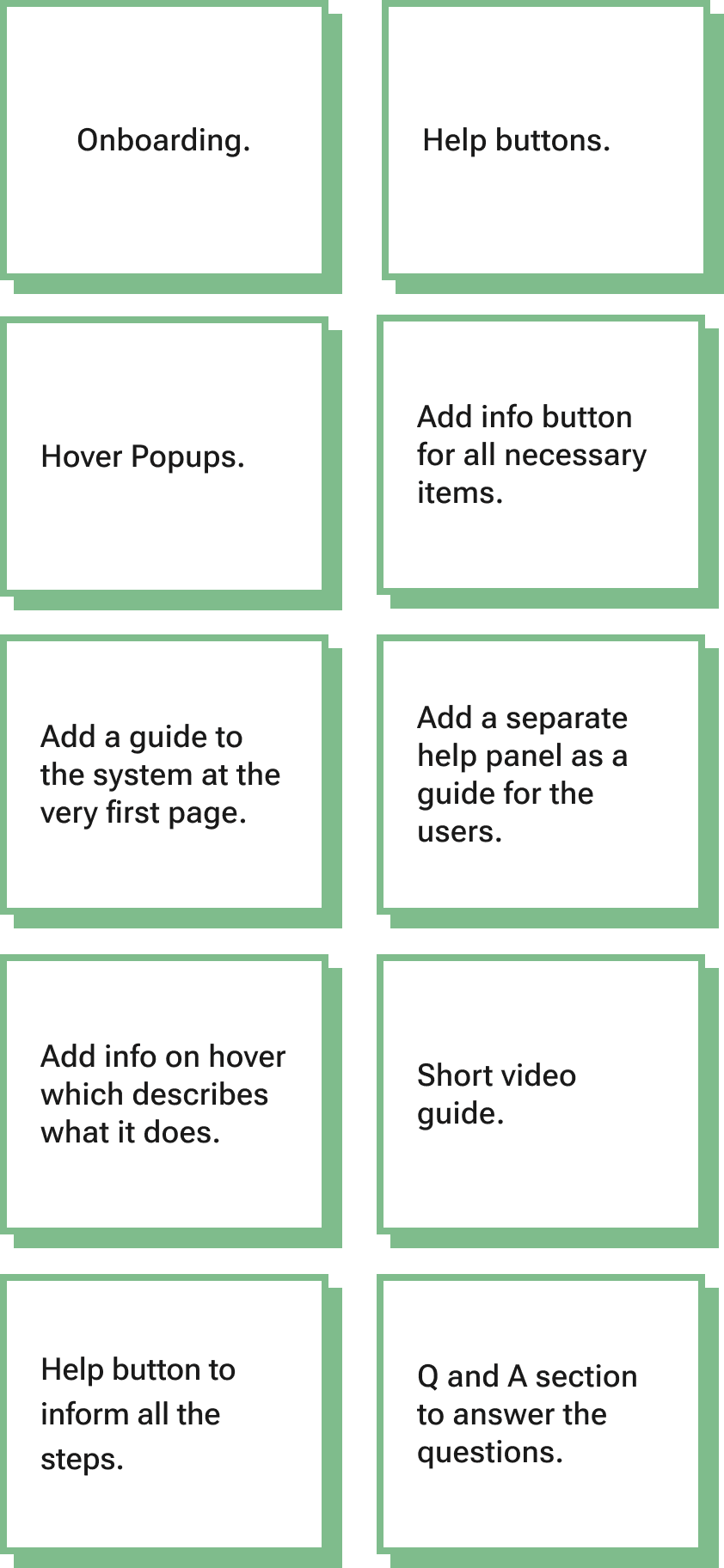
How might we use design cues and visuals to guide users through the website and make desired actions clear?
How might we implement features to prevent user errors?
How might we simplify the website to create a user-friendly, intuitive, and visually clean experience that minimises clutter and improves user focus?
How might we integrate easily accessible help options to assist users when they encounter difficulties?
how might we?

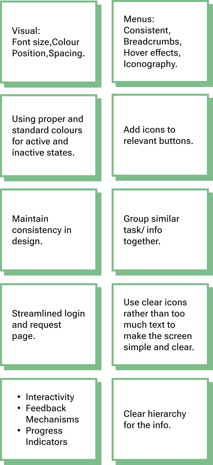
creating low-fidelity sketches for effective solutions
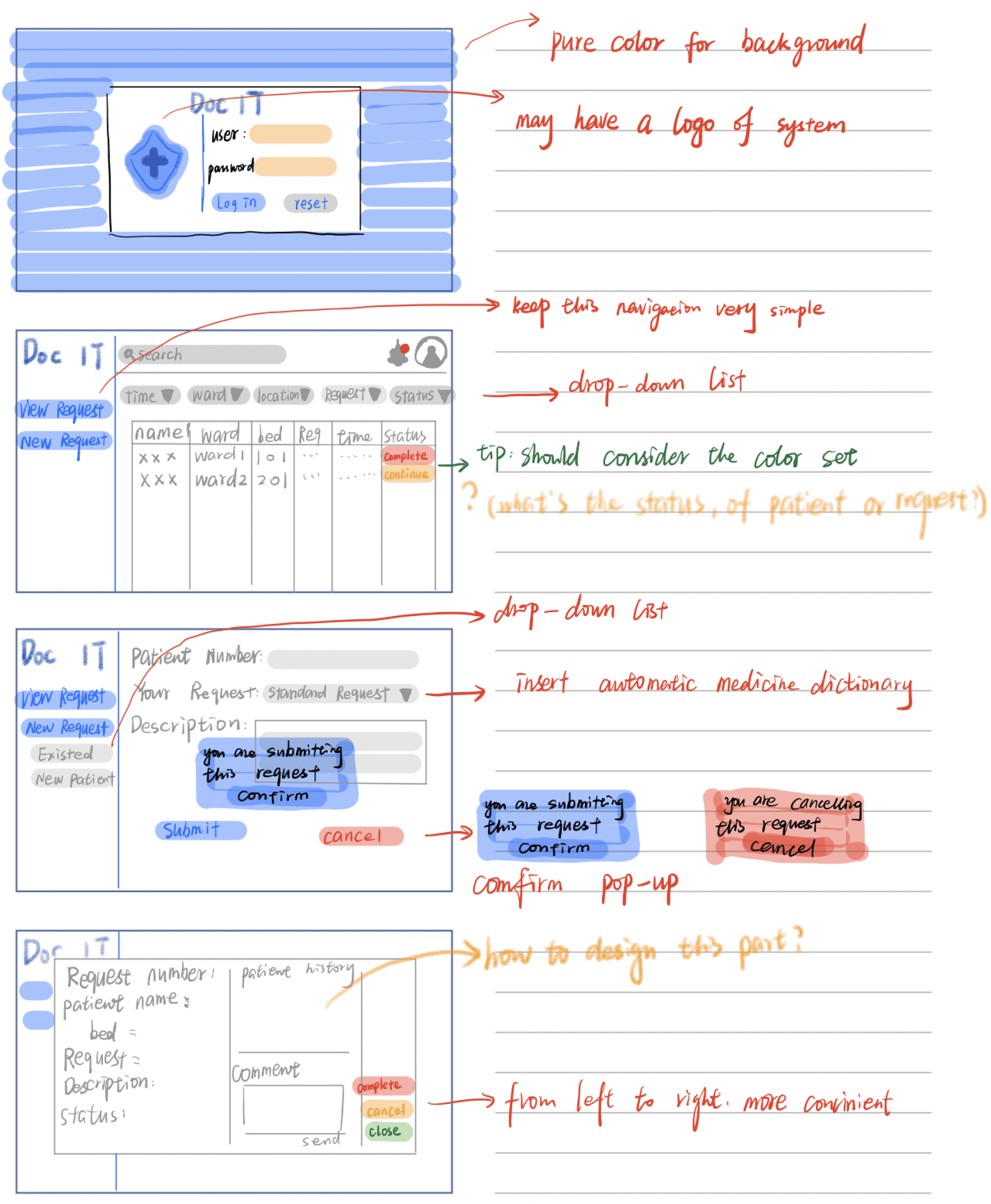
creating user task flows for effective user experience
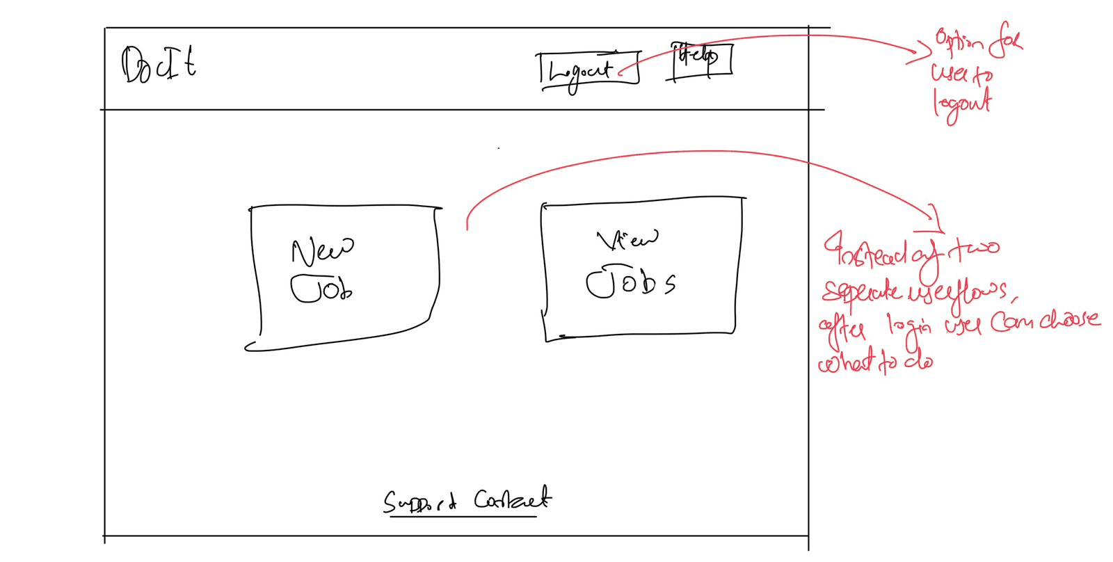
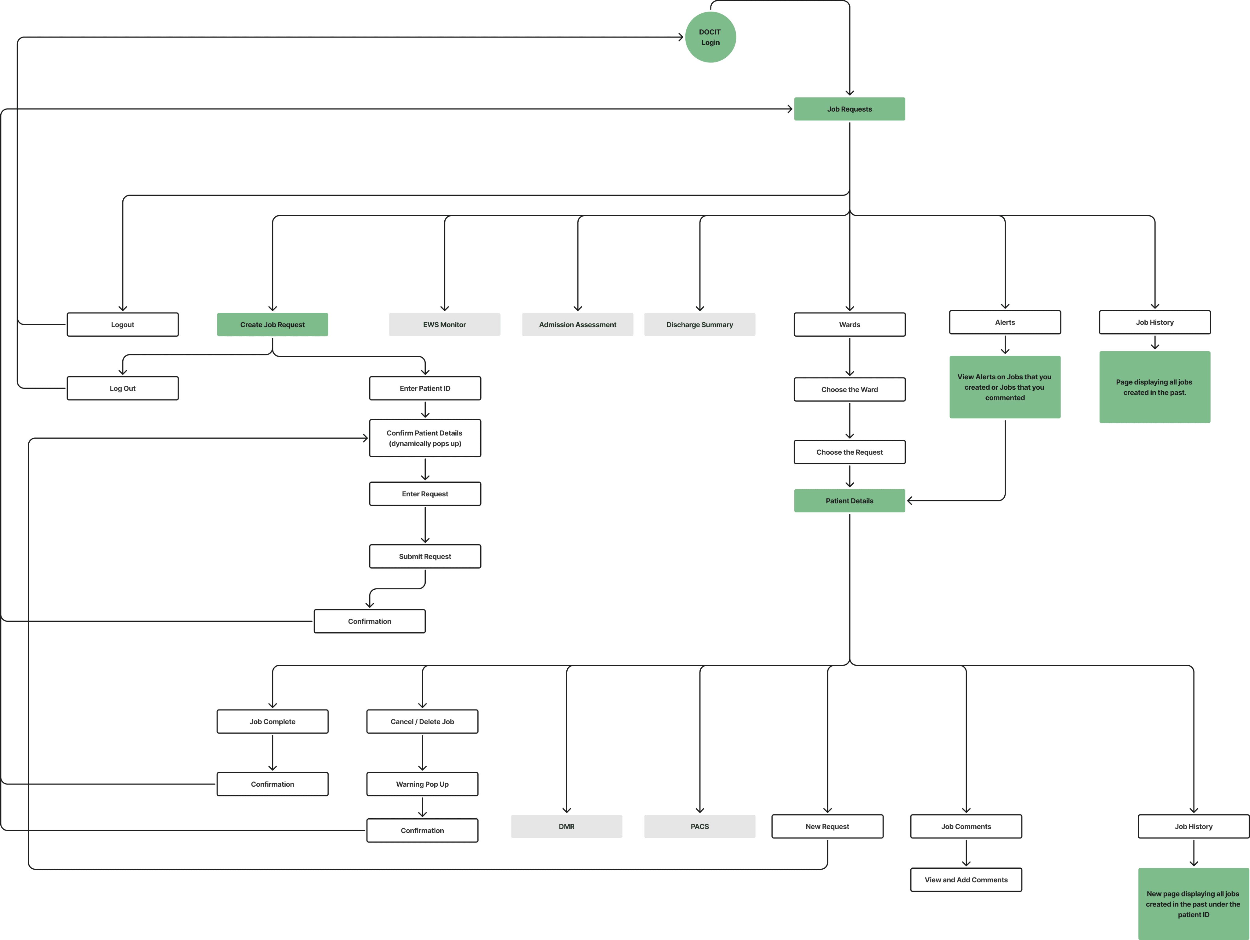
Upon analysing the heuristic evaluation we conducted and the personas we developed, we were able to conclude that the core reason for the hindrance in DocIT’s usability lies in the way its system is designed.
Some of the major changes that we made in the user task flow of DocIT are:
Integrated Create Job Requests and View Job Requests under one Login
Defined the “View Job Requests” page as the Home screen for DocIT
Added an “Alerts” screen in DocIT
STYLE GUIDE
creating style guide for design consistency
We developed a colour palette accessible to users with all types of colour blindness, using tools Figma's "Colour Blind" plugin, ensuring it met WCAG colour contrast standards for accessibility. For fonts, we chose the dyslexia-friendly Arial after considering readability, font weights, and following guidance from the British Dyslexia Association. To ensure consistency, we used icons from Google's Material Design kit across the design.
Colour Palette
Typography
Blue Chalk
#E7EEF8
Boulder
#767676
Snow Drift
#F9F9F9
White
#FFFFFF
Mango Tango
#DB7600
Black
#1A1B1D
Sapphire Blue
#0F52BA


UI COMPONENTS, BUTTONS & ICONS
COLOURBLIND VISION
Normal
Primary button
Active state
Secondary button
Inactive state
Error state
Protanopia
Deuteranopia
Tritanopia
Achromatopsia
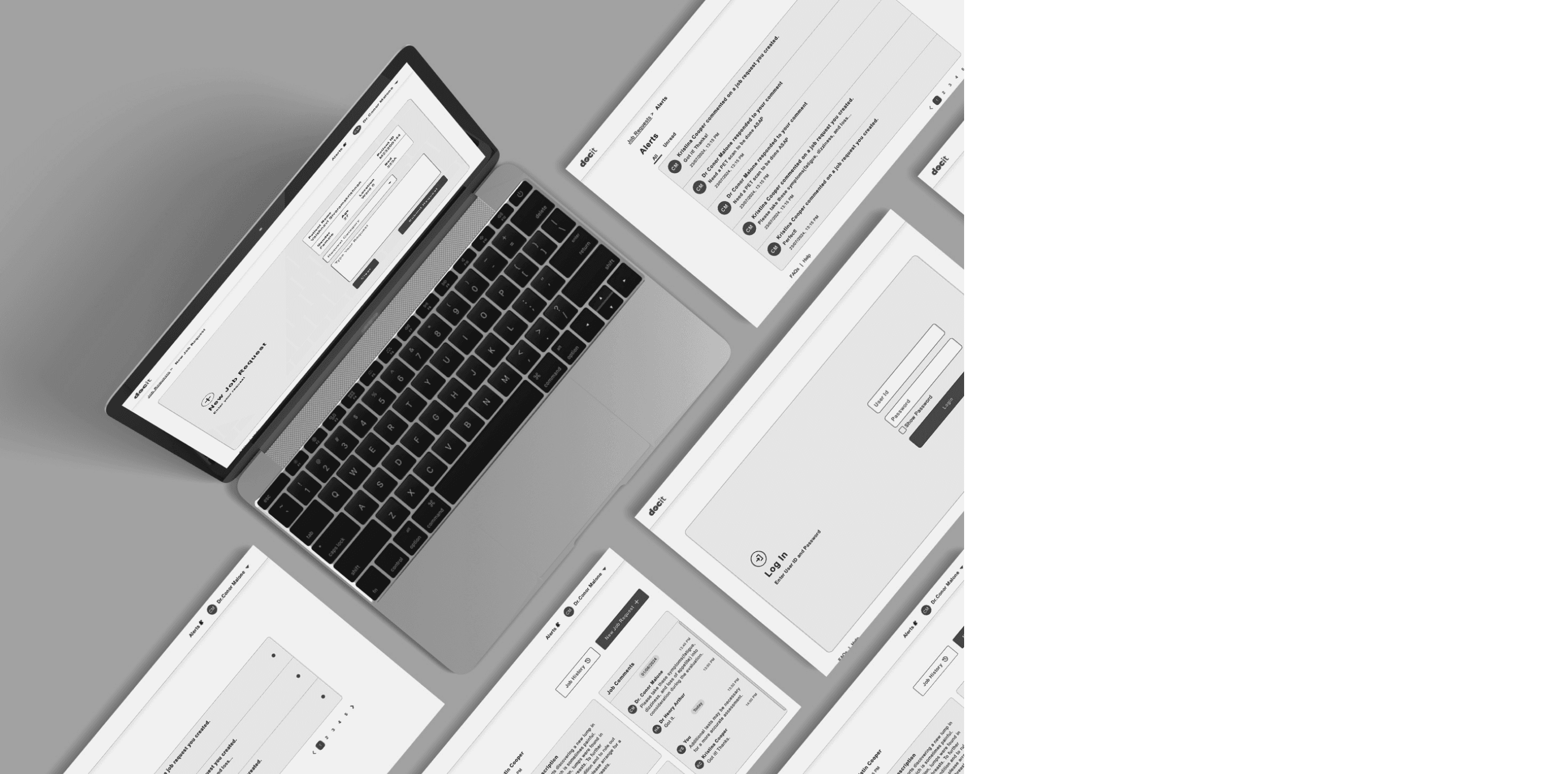
FINAL DESIGNS
DESIGNING FINAL
high - fidelity screenS FOR docit
Following the style guide, we began designing high-fidelity screens for DocIT's new interface. Throughout the process, we ensured proper text contrast for readability and selected color combinations that addressed accessibility for color blindness. The screen layout was refined through brainstorming and iterations on the low-fidelity wireframes from the previous stage.
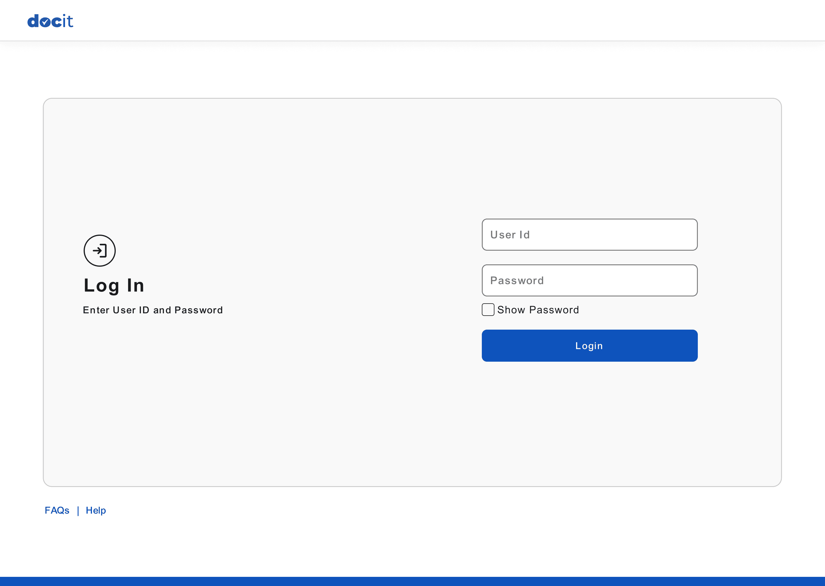
Login Page
User Guides and Help buttons
made available on main screens.
Centralised Login for DocIT
View Job Requests Page (Home Screen)
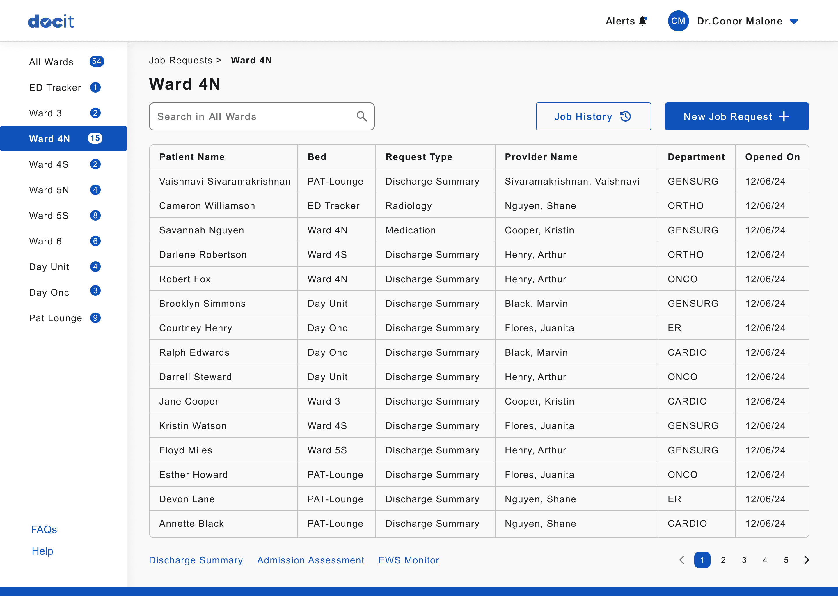
Search for patients
in the selected wards
Alert button to view the
job comment notifications.
Button to create new Job
for any patient.
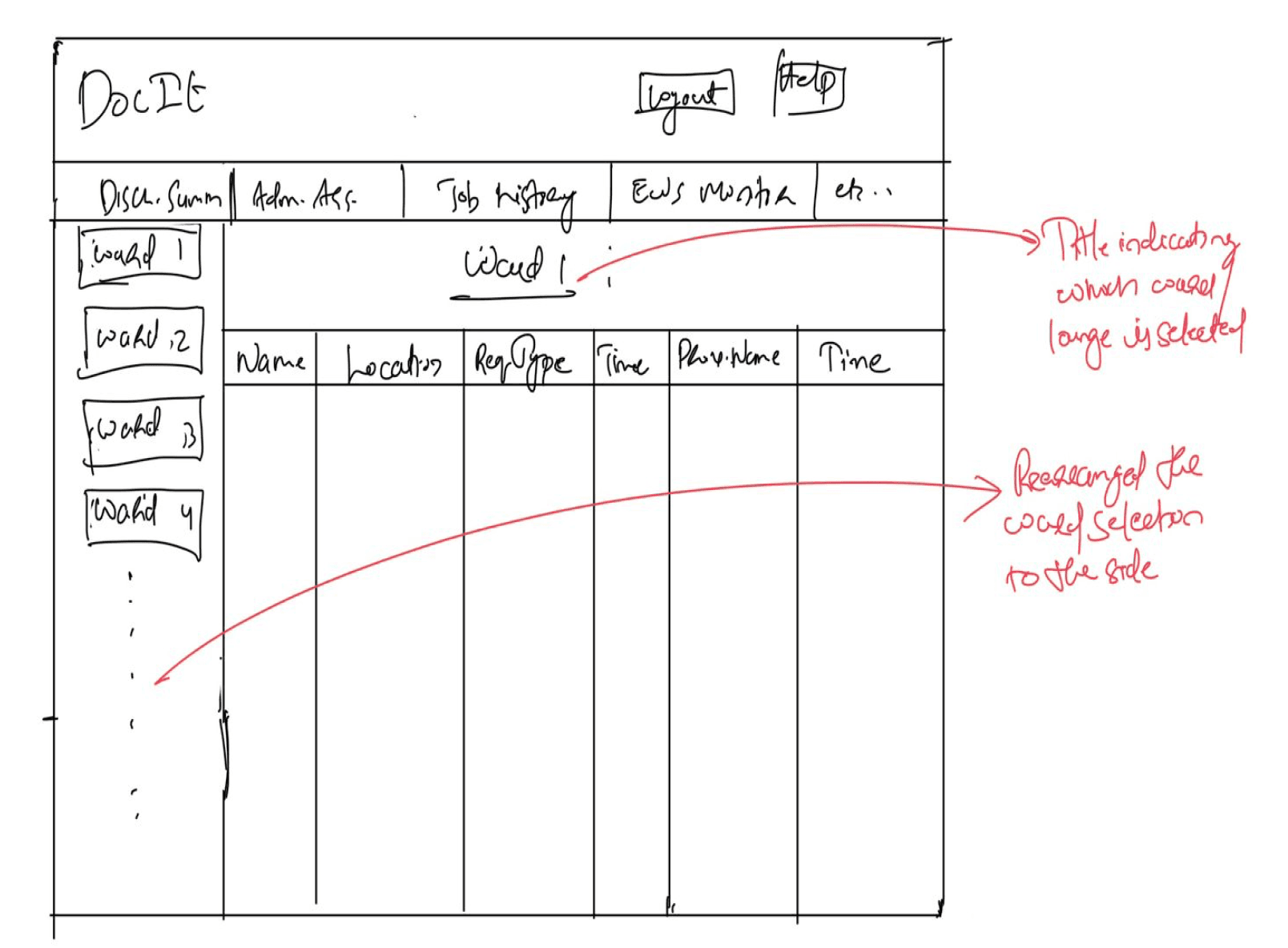
Organised and categorised wards
to the left side of the screen
for easy access and visibility
Button to view the job history
of the entire hospital
Status bar to indicate where the user is currently inside DocIT
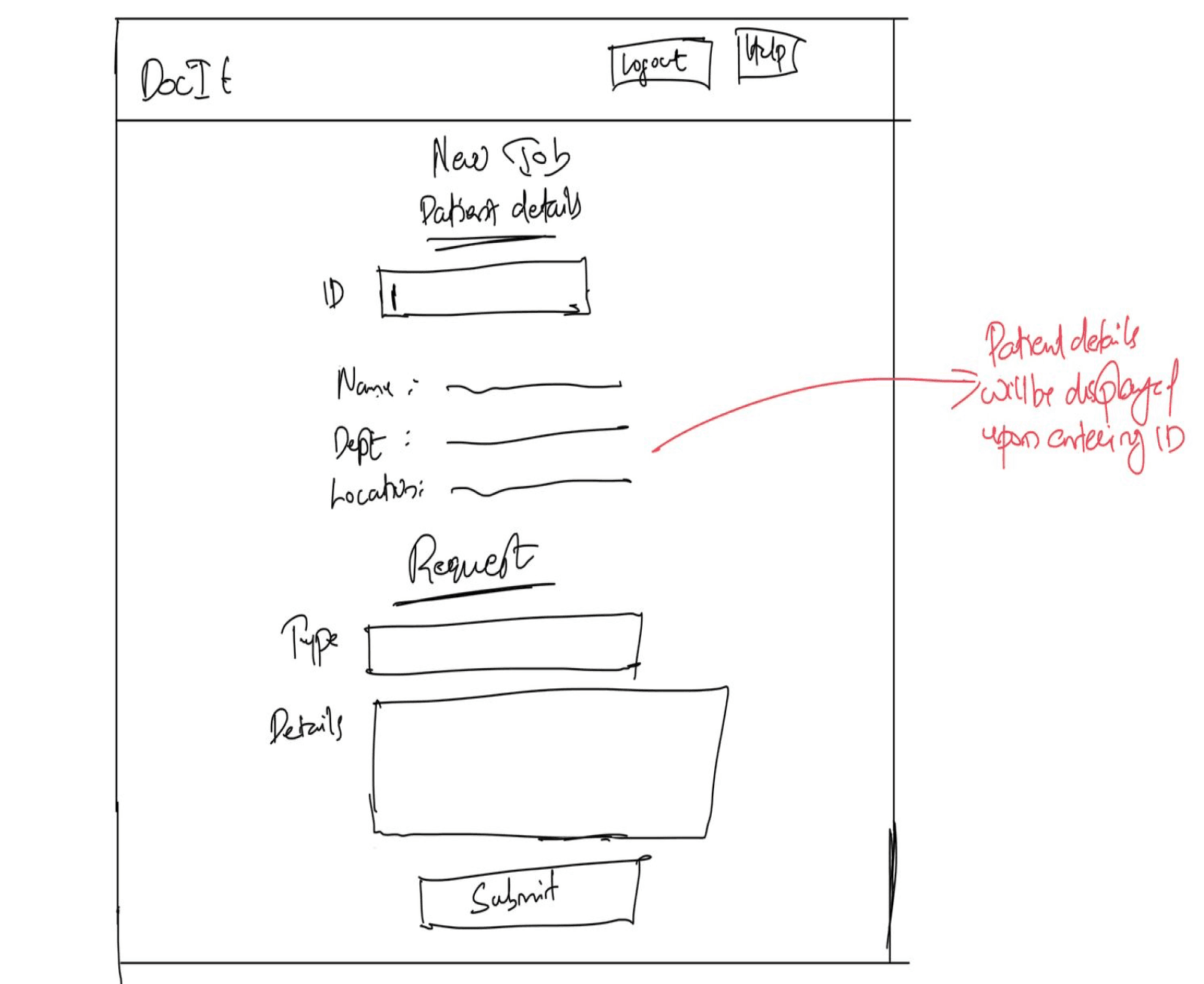
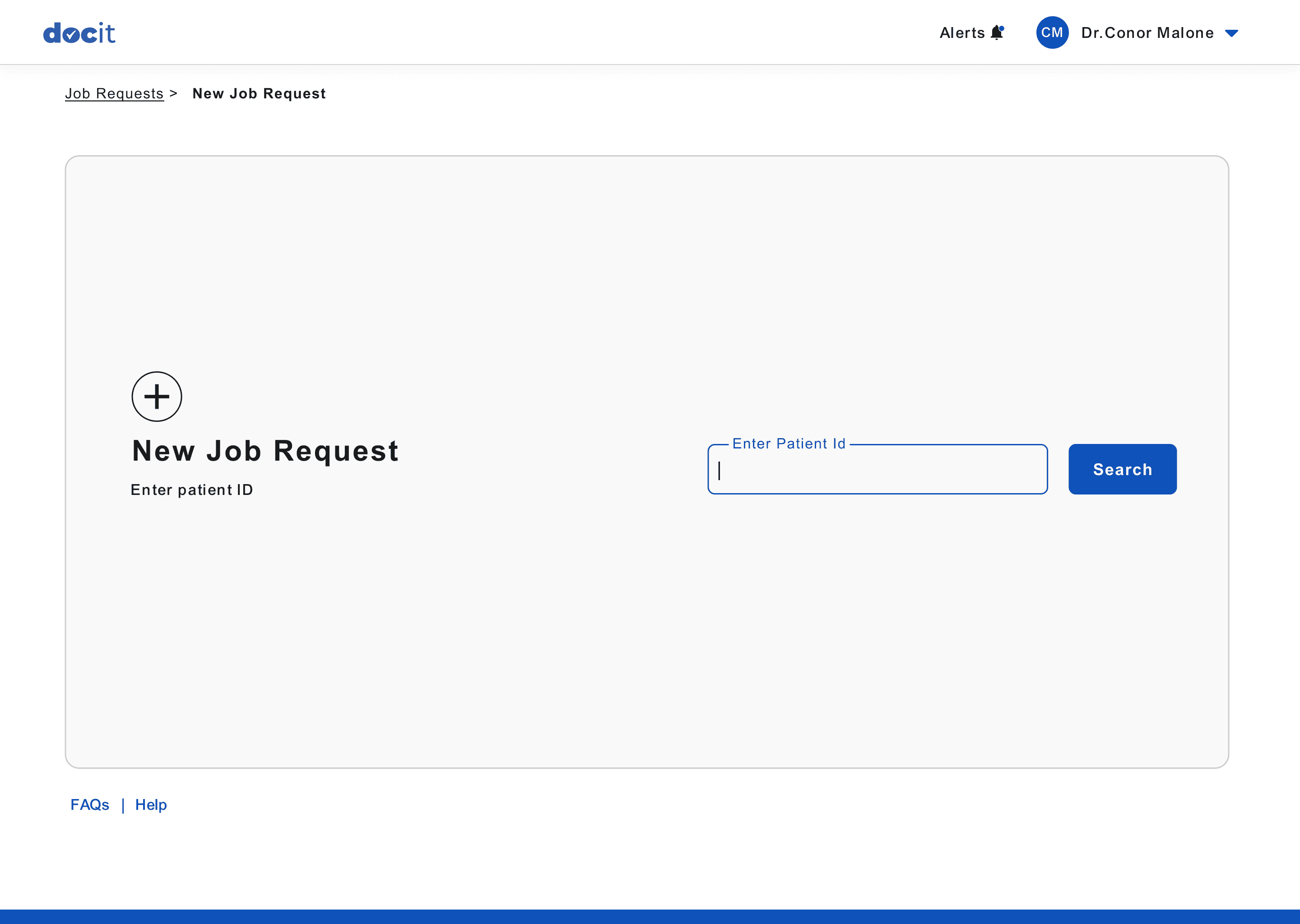
New Job Requests Page
New Job Requests Page - With Patient Details
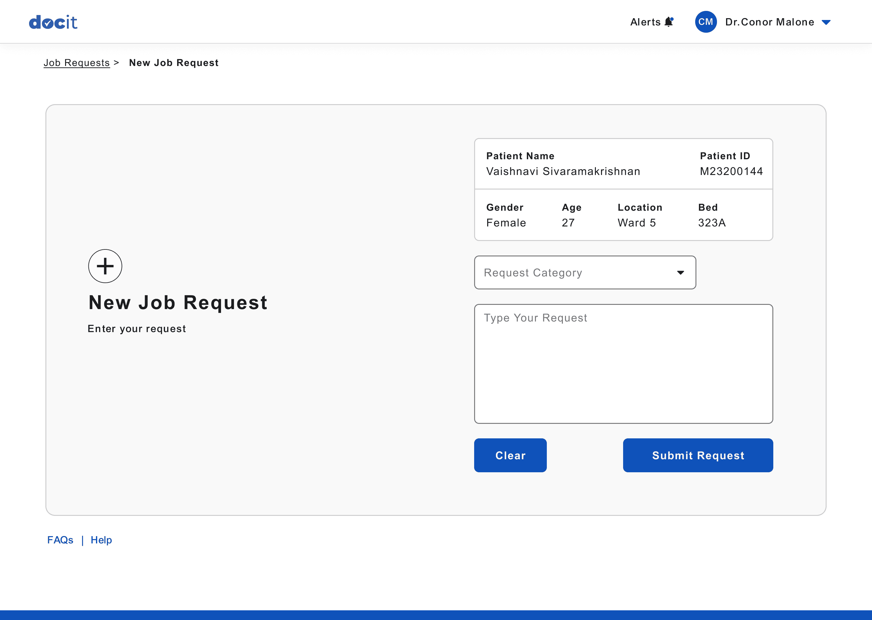
Basic patient details for
the user to confirm the details and avoid errors.
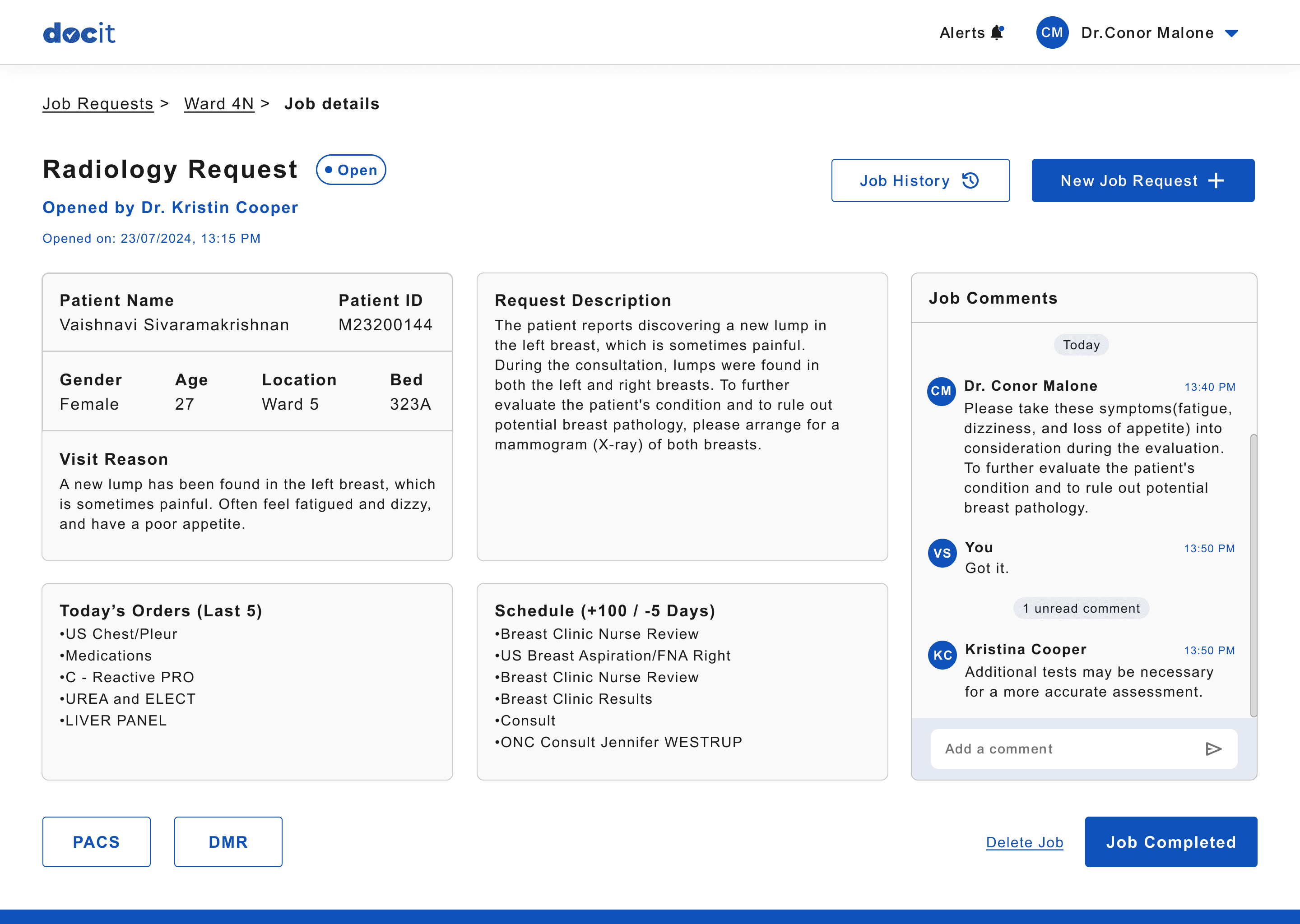
Detailed information about the user who opened and closed the job request.
Button to view the job history
of the current patient.
View and add comments for the job request.
Button to create new Job
for current patient.
Job Details Page
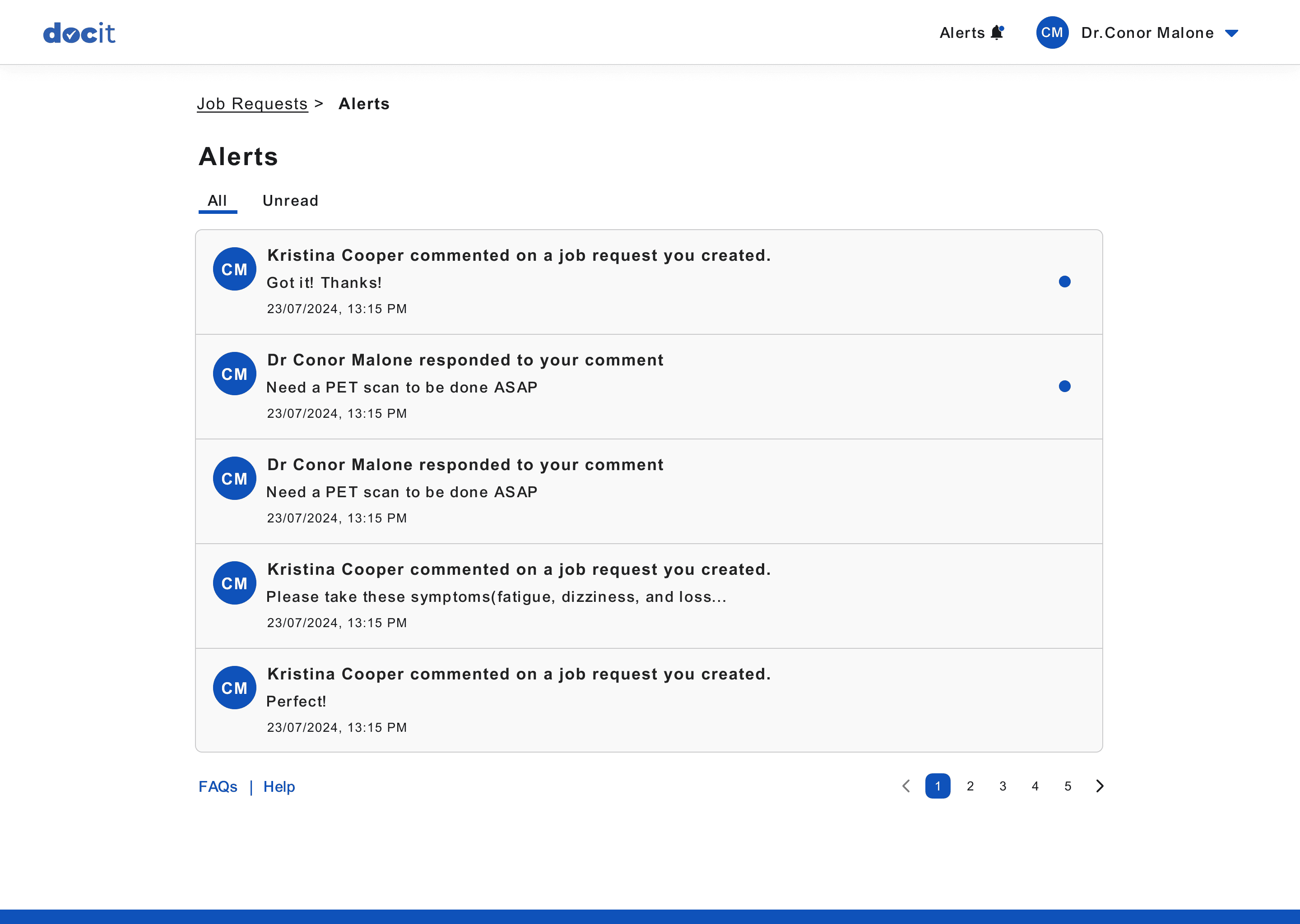
Alert when another user comments on a job that this user created.
Alert when another user comments on a job that this user also commented.
Indication for new alerts
Alerts Page
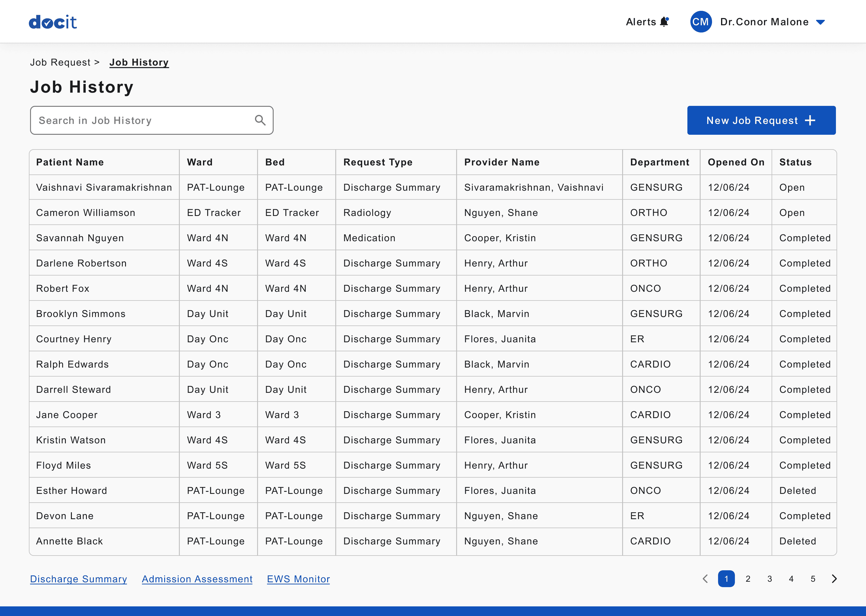
History of all the jobs created in the hospital
Current status of the Job
Job History Page
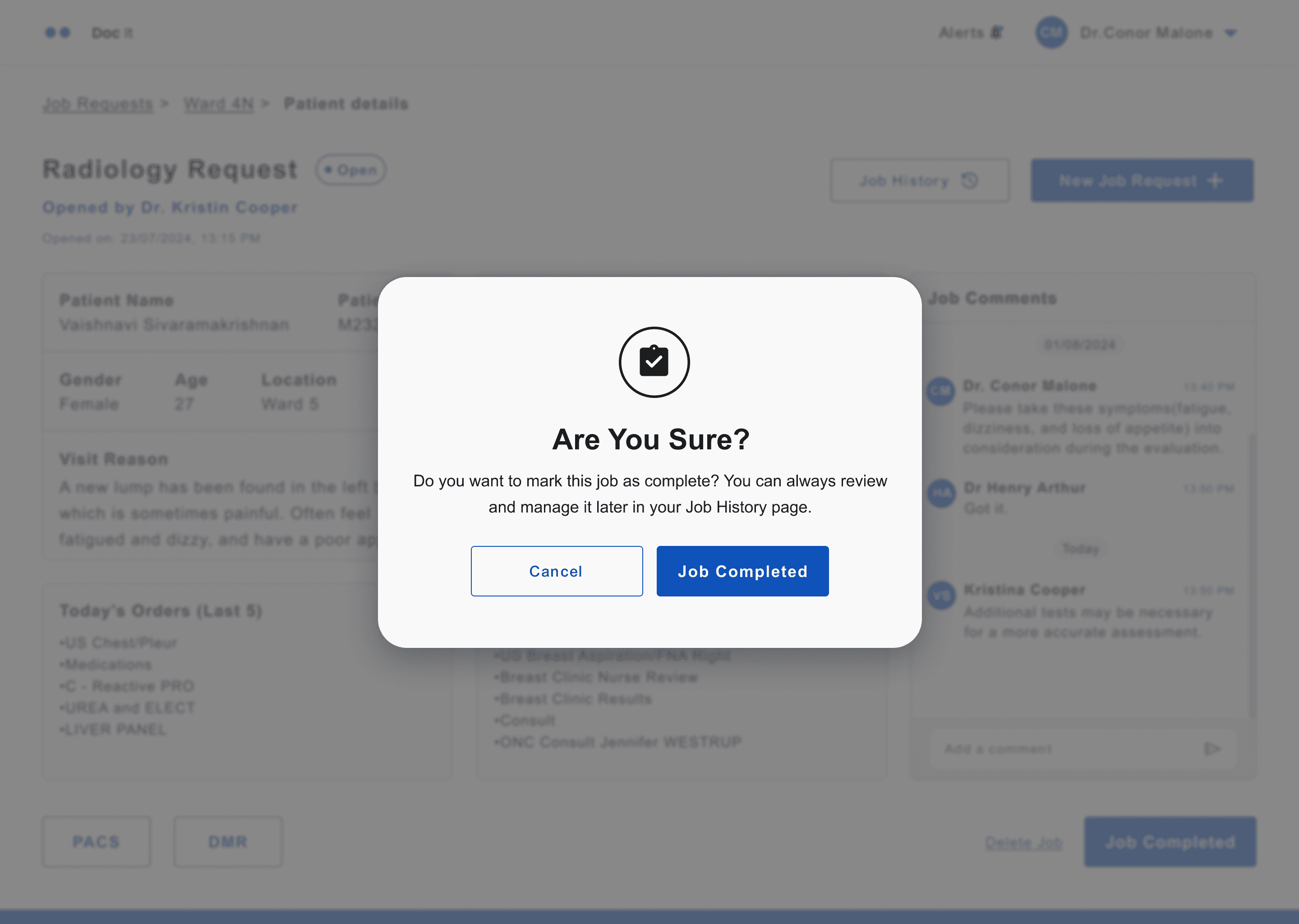
Confirmation pop up to verify the action performed.
Confirmation Pop Up